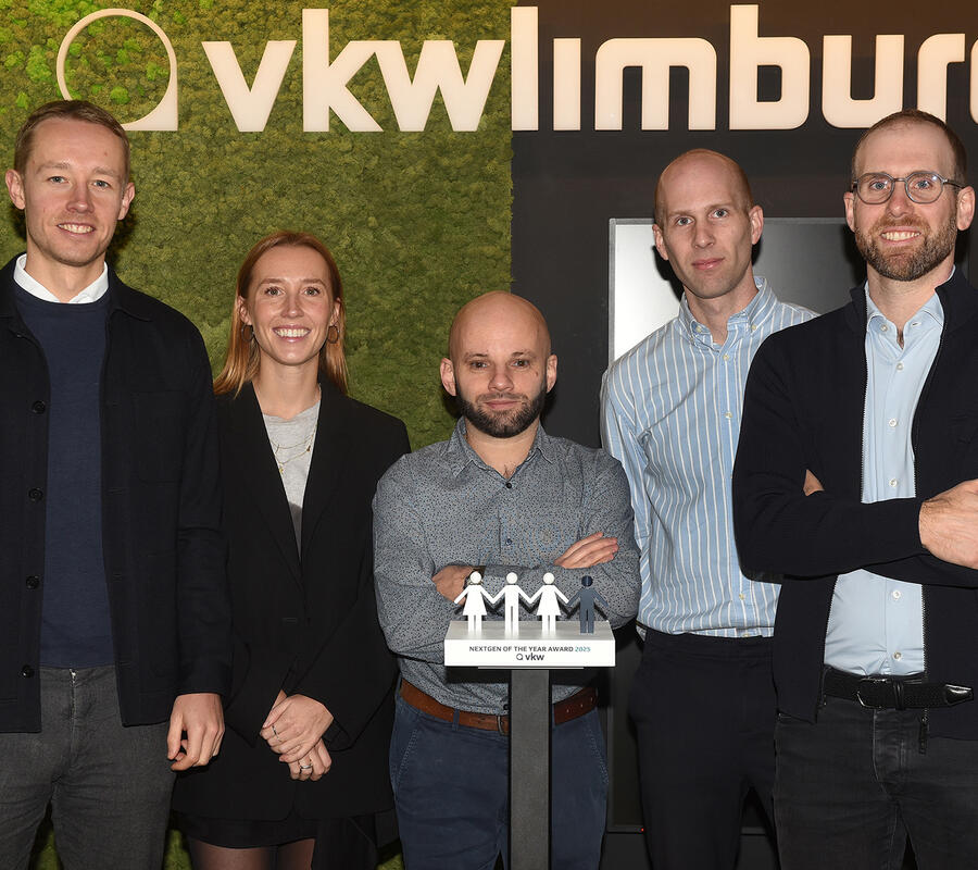
At the start of 2019, Democo Group got a new look: a new corporate identity with a new, uniform logo for all our companies. Since then, all companies within Democo Group have been branded the same mark, making our connectedness more visible to the outside world.
Uniform brandmark
The new logo has been completely redesigned. It consists of two angular forms that meet each other, symbolizing dialogue and collaboration. The shape refers to a roof and thus to our 41 years of experience in contracting, technical services, finishing and development. There is movement within the logo: one shape comes from above and one from below, showing the dynamics of our company and our industry. We learn from the past to better build our future. The forms do not (yet) touch, because it is our task to help things come together: ideas, materials, partners and people.
Fresh websites
In 2019 we also launched new websites for our companies. With a fresh new look, we are more than ready to welcome our 2020 visitors. The texts, content and photos have been updated and tailored to each company: our experts are brought to the forefront, better showing their expertise and the projects they’ve worked on. At the same time, all websites now have the same structure and layout: this way our visitors and customers can find more easily what they are looking for within our family of companies.
Colours with impact
Our colours show that Democo Group is ambitious, with a clear and uncomplicated approach. An active orange shows this ambition for all our companies: it ensures strong visibility for our projects, expertise and experience. A gradient with brick red provides for more dynamic graphics and refers to our building activities. We combine this with a lot of white, for a sleek, modern look and breathing space. Finally, black and grey provide contrast and softness where necessary: a coherent look that emphasizes our professionalism.